
Life Under Quarantine
MIT economist Jeffrey E. Harris reflects on the economics of quarantine in a series of articles.
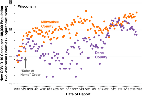
Statewide “Safer At Home” Order Entered Into Effect on March 24, 2020; data and image from Life Under Quarantine
Research and Resources for the Pandemic
Main Page | Economic Impacts
EXCERPT | LIFE UNDER QUARANTINE | JULY 25, 2020
"We begin with a comparison of the incidence of confirmed daily COVID-19 cases in Wisconsin’s two most populous counties: Milwaukee County, which includes the City of Milwaukee; and Dane County, which includes the City of Madison. Raw counts of positive COVID-19 cases in these two counties are regularly reported by the Wisconsin Department of Health Services. We rely here on the data posted on July 23, 2020. In the graphic above, we have converted the raw case counts into daily incidence rates per 100,000 population, based on 2019 populations of 945,726 for Milwaukee County and 546,695 for Dane County. The orange-colored points are the Milwaukee County data, while the purple-colored points are the Dane County data. As in earlier articles, we have plotted the incidence rates on a logarithmic scale, shown at the left. That way, a straight line in the graph corresponds to exponential epidemic growth.
"The two counties are situated in the same state. They share the same governor, the same state legislature, the same state supreme court, and the same state department of health. They have been subject to the same statewide policies. Yet they show distinct patterns of evolution of COVID-19 cases during nearly five months that the United States has endured the pandemic. Our task here is to inquire why."
Full article at Life Under Quarantine
Life Under Quarantine main page
Suggested links